The life of Gerald Wilde was a testament to creativity. He was a vessel in which a unique inner vision co-existed precariously with an ill-fated destiny. His lack of public recognition and physical hardships were beyond most artists’ endurance; a ‘modern’ man might well have crumpled at the first blow. His reward would always be in the present moment, the satisfaction of a colour well-balanced, a form triumphant in its emergence. To look back or even look forward was too dangerous an undertaking. His experiences were channelled directly onto paper and canvas through one unblinking eye to an often-shaky hand. In a childhood accident involving a knitting needle and his mother, he lost the vision in one eye. His world was one of hazards confronted; he lived on a razor’s edge of insecurity. It was a life he would never have asked providence to bestow, but it followed a path that allowed a truly original British talent to emerge.
I was fortunate to know Gerald well during a period in which he was producing some of his most successful mature work. In 1971, he had been providentially invited by the spiritual philosopher J. G. Bennett (1897-1974), previously a scientist, mathematician and industrial research director, to join him at Sherborne House in Gloucestershire. Wilde had worked with Bennett in the 1960s creating artworks for Bennett’s books. At Sherborne House, a neglected but once magnificent stately home, Bennett provided Wilde with free board and living/studio accommodation in a long, stone outbuilding, formerly a stable. That year Bennett had begun a five-year project to share with 100 international students each year the teachings and experiences he had gained over a lifetime of working with eminent spiritual teachers. I arrived in 1972 from America at the age of 21 with an arts background and little confidence to attend the second 10-month residential course, and afterwards was asked by Bennett to stay on and work as part of his publishing company, Coombe Springs Press. There I collaborated with Gerald on many book projects and developed a long-lasting friendship with him.
Gerald was a daunting figure of a man, short and stooping, frequently shouting at any student who dared enter his sacred studio space by mistake or curiosity, or at children who too frequently made a game of taunting him. I have memories of Gerald shouting flamboyant Joycean stream-of-consciousness abuses, arms waving, terrifying children and adults alike. Yet with me he was always soft-spoken, gentlemanly and highly sensitive, as he was with white doves that he fed daily outside his studio. He frequently sent me letters with images of artworks he admired, and invited me for afternoon teas that he would make on an old wood-burning heater. The visits would always be punctuated by his recounting outrageous and amusing stories about the many renowned British artists he had known well.
When I was living at Sherborne House, Gerald was in his seventies, producing dynamic and exciting artworks. Hidden in the Cotswold landscape away from the London art world’s whims, seductions and neglect, he still had, even after Bennett’s death in December 1974, a secure studio space, respect and care from a few good people. From the time he arrived at Sherborne in 1971, his long-suppressed creative energy was like a thunderbolt unleashed. He accepted life’s blows in true samurai spirit, asserting an inner freedom in sharp contrast to the restrictions of his external life. Before his 1979 exhibition at the October Gallery in London he declared, ‘This show will not be a retrospective’, and indeed it was not. He continued to make artwork that was visionary, daring and outside the mainstream until his death in 1986. Wilde’s life cannot be separated from his oeuvre. All of his artwork was done against the odds, and the survival of any of his delicate drawings, lithographs and paintings is nothing short of a miracle. Despite having had worthy admirers of his work during his earlier career, notably David Sylvester, John Best and John Berger, his artwork was rarely given the recognition that it deserved.
Joyce Cary on Gerald Wilde
Joyce Cary’s book The Horse’s Mouth was published in 1944 and Wilde felt an immediate affinity with the artistic plight of Gulley Jimson, that true pilgrim who gives up all of his worldly goods for the cause of ‘Art.’ Cary described his character Jimson as having ‘the curse of Adam’: ‘If he doesn’t work he doesn’t get anything, even love. He just tumbles about in hell and bashes himself and burns himself and stabs himself. The poor bastard’s free – a free and responsible citizen. The fall into freedom. Yes, I might call it the fall into freedom... Free to cut his bloody throat, if he likes, or understand the bloody world, if he likes ...’[i]
Jimson is Cary’s mouthpiece for his own views on art, a ‘portrait of the artist as an old man.’ Like Jimson, Wilde had no control over his existential plight; it was, quite simply, always a matter of survival. Of his early life Wilde recalled: ‘I didn’t seem to have any ambition. But I had one itch and that was to get on to paper. That was all. I used to give the paintings away. I walked away from life. I would rather be that way than so confident and sure of myself that I stamp over anybody. Humility is my greatest vice.’[1] Rumours still persist that Wilde was the original model for Gulley Jimson, and The British Council of Visual Arts’ website states that Gulley Jimson is ‘widely acknowledged to be a portrait of Gerald Wilde.’[2] Years after the publication of The Horse’s Mouth, Cary was flattered by the comparison to Wilde, and said that had he not invented the character himself, Wilde would have served the purpose well. Cary did not actually meet Wilde until 1949, five years after the book’s publication when the New Zealand novelist Dan Davin invited Wilde to stay with his family in Oxford. There, Wilde became friends with Cary, Iris Murdoch, Enid Starkie and A.J.P. Taylor. Cary bought a number of his paintings and tried to bring him to the attention of the media, and acted, together with Henry Moore, as Wilde’s sponsor. They persuaded the Artists’ Benevolent Institute to pay his rent and make materials grants.
In a 1955 essay, Cary wrote evocatively of his first encounter with Gerald.[3] "The first time I met Gerald Wilde was, I think, about ’49, in Oxford, at the Davin’s [Dan and Winifred]. It was late in the evening … when I heard a queer noise and saw in the middle of the room, a figure strange even in that gathering place of poets and professors; of dreamers in all dimensions. At first glance in the dim light, Wilde seemed like a spectre. His long, dead-white face with its hollow cheeks was like the mask of a bleached skin on a skull, his arms seemed but bones, hanging loosely in the sleeves of an enormous coat whose crumpled folds gave no room for flesh. The arms, too, were extremely long, so that the bony hands almost touched the floor. It was as if this skeleton had but half-risen from the grave ... Wilde was a painter who thought of himself as a Gulley Jimson in the world, and seeing me unexpectedly, he wanted to explain, all at once, his feelings about the books, about Gulley, about the relations of artists and public. Since then, he has talked to me on all these matters, with the detached tentative air rather of positive conversation than obsession ... I have often thought how true to the fact was that first apparition of Gerald Wilde, in the Davin’s sitting-room; he seemed like a revenant from another world of spirits, and so he was. He came to us out of a dream that he could not even describe, or explain, he could only paint it. For such a world, that realm where the original visual artist lives as naturally as we in our familiar conventions, is so alien to that of the judgment, of the critical reason, that judgment and reason themselves are barriers about it. A painter like Wilde is born to his own visionary dimensions, and it is one necessarily so alien to his contemporaries, that it is equally hard for them to conceive it, or for him to describe it ... You cannot classify Wilde’s art. It is not representative; and neither is it abstract. It conveys the most powerful impressions by means of form and colour of which the relation is not so much to an actual world of objects as to the real world of a fundamental and universal experience. I cannot explain what I feel before the grand and strange complex of Wilde’s Rocky Landscape, or his Green Seascape, or the Landscape that he never named, that I call the Woman on the Shore, or his Creature. But for me they belong emphatically to the category of great art. And they are profoundly original."
Early life and work
Gerald was born in 1905 in Clapham, London. His mother was an actress of considerable character, his father a surveyor and architect. After a short and unsuitable apprenticeship to a solicitor, Wilde was encouraged towards the arts by his mother and her friends, Lord and Lady Alfred Douglas. He studied at Chelsea Art School from 1926 to 1931 and from 1934 to 1935 was under the tutorage of Graham Sutherland, Henry Moore and Percy Jowett. At Chelsea he was marked out early as an original talent.[4] He had a great facility for lithography and interpreting still life subjects through that medium. A small 1929 print, Dressing Table is meticulous in detail and already shows the signs of a compelling, obsessive vision.
Three stages of development are apparent in Wilde’s career. The first, from 1929 to World War II, shows an affinity he had with Baudelaire and the decadents. The figures in his artworks nihilistically inhabit un-romanticized city scenes, and aggressively fluid ink and gouache drawings assert a defiance of bourgeois concerns. In 1935 he shared an exhibition with David Kenworth (Lord Strabolgi), Brian Robb and Edward Wakeford, R.A. at the Bloomsbury Gallery. This show would have been composed entirely of lithographic works, for it was not until 1936 that he began to use more direct media such as ink, gouache and oil.
In 1936, Wilde took part in two important exhibitions in London: the International Surrealist Exhibition and Abstract and Concrete. That year he took a room in Battersea, sharing it with another painter and the writer John Best. Best remembers that Wilde usually worked at night, but if it were daytime he would close the curtains and draw by electric light. He had an impressive knowledge of modern art but seldom visited galleries. He was a frequent visitor to public libraries and was never without books on art. Wilde’s work from this period was figurative but rarely was it taken directly from life. Early titles such as Three Prostitutes (1937, gouache), Les Fleurs du Mal (1936, ink), Mexican Scene (1937, pastel), The Cinema (1937, oil) and The Prisoners (1941, crayon and ink) give an early sense of his very personal perception of the world.
Wilde’s artwork of the late 1930s and early 1940s are often associated with the British neo-romantic movement along with his contemporaries Graham Sutherland, Ceri Richardson, Paul Nash, John Piper and Ivon Hitchens. The obvious difference between his work and theirs is his choice of the city for inspiration rather than a romanticised countryside. David Sylvester observed that ‘when Wilde’s townscapes have no figures in them there is a “positive” absence of them, whereas when they are present they tend to be hunting packs, keyed up with the sort of aggressive, unhopeful hunger for excitement that we sense in the people milling around Piccadilly Circus about midnight. Whether there are figures or an absence of figures, there is a Baudelairean feeling about the corruptness and loneliness and apprehension and elation of city life by night.’[5] Indeed, one has a visceral sense of vertigo and the unrelenting activity of London within Wilde’s 1946 painting Piccadilly Circus (gouache) with its neon-like high-key colours. Wilde’s art was always passionately expressionistic. Reviewing a 2004 exhibition of Wilde’s work, art commentator and historian Adrian Clark wrote: ‘In his oils, Wilde meshes the colours – many of them – densely and thickly. But unlike, say, Auerbach, whose thickness of paint can be so overpowering to its putative subject matter, Wilde’s work communicates something. The sky in this Fata Morgana is swirling and powerful; fierce, turbulent colours, like a Munch or Nolde. We haven’t had many artists in this country who could really be said to have been expressionist in the North European sense, but Wilde is perhaps one of them.’[6]
The 1940s and 1950s
The second period for which he perhaps is best remembered concerns the 1940s and 1950s. Art critic William Feaver wrote that in ‘the 40s he was, unknowingly, an “advanced” artist, without pretention and with a genius for fixing everything he sensed and felt in his images.’[7] Highly charged colours and lyrical line work merge to produce expressionistic figurative and abstract compositions. Yet his lifestyle was impoverished and consequently his artistic output was erratic; periods of reclusiveness and depression were common for him. In 1941, Wilde participated with Duncan Grant, Paul Nash, Hans Tisdall, Graham Sutherland and John Piper in the Manchester-based Cotton Board's exhibition Designs for Textiles by Twelve Fine Artists, organised as part of the wartime export drive.[8] In 1946, Zika and Lida Ascher commissioned Wilde to produce textile designs for Ascher (London), as well as Matisse, Picasso, Calder, Cocteau, Sonia Delauney, Derain, Sutherland, Moore, Hepworth and Piper in the following years.[9] The Queen, then Princess Elizabeth, wore one of his Ascher silk designs on the 1947 Royal Tour.[10] In 2010, Ascher announced that they were re-launching a design by Wilde in three colour-variations, as well as scarves by Sutherland and Feliks Topolski.[11]
The East End of London was what Wilde knew best and was what he portrayed in his artworks of this period. John Berger aptly compared Wilde’s By Grand Central Station I Sat Down and Wept to a Euston Road Soutine painting.[12] The comparison is an apt one. Soutine also worked in isolation and similarly tried to capture elusive perceptions of reality, returning obsessively to highly subjective portrayals of anguished faces and tormented landscapes. His paint, too, is used aggressively; one is unsure if the emotion is that of the subject or the artist, so complete is the union. In 1955, David Sylvester pointed out important differences between the two artists. Firstly, in Wilde’s ‘readiness to allow figuration to be swept away by the tempestuous rhythms and forces that hurl themselves through his paintings, and secondly, in the far greater complexity of those rhythms and forces. Centrifugal forces, centripetal forces, diagonal rhythms, swirling rhythms, jagged rhythms, queasy undulating rhythms – all are opposed in a painting by Wilde and miraculously balanced on the edge of chaos. To look at the serene, almost topographical, little study of the Horse Guards Parade is to see why: Wilde is an artist the paroxysmal violence of whose gestures is balanced by a most delicate and precise control of colour and design.’[13]
Wilde portrayed the world he experienced with exceptional talent. Already in Infernal Group (1941, gouache) and Figures in Arches (c. 1930-49, gouache) there is a taste of the dynamic rhythms that will come to figure strongly in his late work. The heavy black outlines of this period are reminiscent of Rouault’s subject matter; Biblical scenes, prostitutes and the most seamy and squalid aspects of life. They echo Wilde’s concerns for the seemingly opposed worlds of the mundane and the supernatural. Wilde would have been aware of Picasso’s ground-breaking painting Les Demoiselles d’Avignon (1907), but his The Three Prostitutes (1937) was simply another observed street phenomenon that provided a suitable vehicle for expression. While the art critic John Russell Taylor found The Three Prostitutes to have a taste of Edward Burra (a painter whom Wilde greatly admired) about it[14], the mood of the painting also has echoes of German Expressionist work, such as Kirchner’s 1913 painting Five Women in the Street, both artists employing strong colour and evocative draughtsmanship.
In 1938, New Burlington Galleries held the seminal exhibition Twentieth Century German Art. Max Beckmann showed six of his paintings and while in London felt an immediate affinity with the Tate’s collection of William Blake’s visionary work. Like Beckmann and Kirchner, Wilde was living a modern life and his interpretation of it was similarly highly personal and perhaps fatalistic. The onset of World War II had changed everything. Much of the artistic experimentation with pure abstraction that was being done in London was left behind as the reality of war took sobering precedence. Yet the war had a spontaneously liberating effect on Wilde and his artwork as he witnessed his much-loved city change dramatically overnight. He enlisted in the Pioneer Corps, his unit being put to work on demolition sites in London that included Buckingham Palace and Broadcasting House. But, after developing severe chest trouble, he was discharged. There was no shortage of labouring jobs for him during the day, and at night he painted. John Best found him unaffected by the Blitz and stimulated by the blackout. In 1941, Kenneth Clark (later Lord Clark), then Director of the National Gallery, bought some of his work, as did Graham Sutherland.
Wilde’s paintings of the 1940s and early 1950s show complete integration of his experiences and ideas, and continue to stand up as being some of the best post-war work done in England. They also have an affinity with American Abstract Expressionist work of the same period. Blue Dog in Landscape (1942) shows the transition of figurative compositions into rhythmic linear work as he developed a new spaciousness within his work, every inch of the surface being activated with rhythmic energy. This new sense of space allowed him to communicate with even more freedom as colour, form and line were liberated. The lyrical qualities of Blue Dog in Landscape contrast strongly with the melancholic feeling created by the blue canine bypassing the isolated couple. The strides made between Infernal Group (1941) and Blue Dog in Landscape are tremendous. Tragically, during the Blitz his studio was bombed and all his work was destroyed in the fire that ensued. The lost work was expressive and instinctual, and the absence of those pieces perhaps accounted for his slipping from visibility after the war.[15] Yet David Sylvester also noted that little of his work has survived for other reasons, as well: ‘[H]e had sold too many off as he went along, sold them off for next to nothing so as to get some money to buy drink or to give away to strangers in the pub or, literally, to burn, when he chose to demonstrate his independence by throwing the contents of his wallet on the fire.’[16] Sylvester also felt that Wilde’s work, perhaps at its peak in the late 1940’s, was simply ‘too tough, too demanding, too far ahead of its time to sell.’[17]
This was also the time of Wilde’s camaraderie with an eminent artistic and literary group who found drinking havens in Fitzrovia and Soho. It included Robert Colquhoun, Robert MacBryde, Francis Bacon and John Minton, and the poets George Barker, Paul Potts, Gregory Corso and Allen Ginsberg.[18] Wilde also had close friendships with Dylan Thomas, Tambimuttu (then editor of Poetry London who published his work), David Sylvester and Julian Maclaren-Ross, who celebrated that time in his Memoirs of the Forties. Although a highly sensationalised and personal account, the book portrays the side of Wilde’s life which has sadly been given most publicity, that of the starving ‘Mad Artist’, to quote Maclaren-Ross.[19]
With close links to Fitzrovia and Oxford, it is not surprising that Wilde was attracted to literary imagery and inspired to put those ideas on to canvas and paper. He produced a marvellous trilogy of full-colour lithographs to illustrate T.S. Eliot’s ‘Rhapsody on a Windy Night’ for Poetry London in 1944, and a fabulous lithograph of a lyrebird for its cover. These highly contemporary images were painterly and audacious. The similarity of the lithographs to the early work of Jackson Pollack and Arshile Gorky during the same period is quite startling. There is obvious sympathy with Pollock’s drawings and paintings prior to his drip paintings in the overall working of surfaces and sureness of hand. The emergence of natural forms within Wilde’s lithographs is particularly similar to Gorky’s 1943-44 paintings The Waterfall and Water of the Flowery Mill. Wilde’s Untitled of 1945 is a fine example of his affinity with Abstract Expressionism and early European abstraction, such as that of Kandinsky, Klee and Miro.
During the 1940s and 1950s, Wilde continued with fine, innovative abstraction whilst at the same time bringing his more lyrical figurative work to maturity. Woman and Fox (1947, oil) is reminiscent of Blue Dog in Landscape, indeed the animals are interchangeable. As the dating of Wilde’s work is extremely difficult, either the previous dating is incorrect or the theme is one to which he returned. Wilde used colour as space in Woman and Fox, electrifyingly hot and sultry, with a sense of line work that begins the transition to symbol as found in his late work. The sweep of the dog-fox spine curves to link with the primeval female to produce a compulsive, mandala-like maze.
Two Birds (1947, oil), is a tough and unromantic painting, a nightmare rather than a dream, quite unlike Chagall’s imagery. Wilde seems to be processing horrific memories of the Blitz as the blue and purple fallen birds with their dark, sunken eyes appear dead in front of a coffin-like box, everything swirling in a vortex of chaos. All of Wilde’s work has a sophisticated sense of urgency, often as if he were attempting to exorcise a particular memory from his consciousness. Like man’s earliest drawings in the caves at Lascaux, there seems to be a directly focussed intention behind the work. His vision is clear and he has assimilated well the strides made by such European masters as Matisse and Picasso. This is most obvious in Rocky Landscape with Bird and Old Man/Woman with Bird (1949, gouache) with the artificiality of figures imposed upon a landscape, the dynamic composition is created with heightened, flat colours and expressive lines. The physicality of the figures gives them a classical authority. Yet the ominous rocky landscape is not one of pastoral calmness, nor was Wilde’s life.
One of my favourites of this period is a brilliant pastel drawing of 1953, Lyrebird. It brims with energy, freshness and vitality. Cloven-hoofed, macaw-bright, a lyrebird asserts a masculine, menacing stance, perhaps protecting a nesting she-bird in the background. He spreads his flapping wings to warn off the ill-willed. Highly expressionistic areas of swiftly and confidently applied colour interplay with the sweeping, vigorous brush strokes of the birds. Contemporary with this period of figurative work is Wilde’s intelligent experimentation with abstraction. David Sylvester commented: ‘If it makes little difference to the effect of a painting by Wilde whether it is more or less figurative, this is because the most eloquent thing about his paintings is their particular obsessive rhythm. It is a turbulent, convulsive, vertiginous rhythm, verging on chaos, teetering on the very edge of it ... rhythms are thrown together and somehow held in balance: colliding, they check and deflect movement, so that in the end the tempo of these frenzied works is slow and halting. The groups of half-formed figures among buildings, the intricate webs of half-remembered images of the city, twist and turn passionately but without exuberance, grindingly, elegiacally.’[20]
In 1955, John Berger wrote about similar works of this period: ‘[H]is later works, although nudes, birds, and aerial views of buildings occur in them, are more difficult; superficially they look rather like a fire seen through a grate. But their conviction and their amazing strength of line, devouring colour and interlocking shapes, make it obvious that they are not abstractions. They are painted with the passion and denial with which an artist might paint the belly of the woman he loves. Their obscurity is only the result of a frantic focus – one thinks of the vision of a lion, captured, caged in a zoo, and glimpsing between the heavy bars (which are there in the painting) vivid colours and shapes to which he reacts wildly and wholly as if he were still free, Or, if one wants to be more clinical, one thinks that he paints the gates (again the iron bars) on the very perimeter of the Conscious, beyond which is all the raw material which, when it is brought inside, is fashioned into our ideas of heaven and hell. The trapped in all of us can respond to all these works because they strive for all release, and in our recognition of this and of the loneliness and suffering involved, we think – however rashly – of the word “genius”.’[21]
Although Wilde’s work of this period has striking similarities with the American Abstract Expressionists, his spontaneity is controlled and no less powerful for it; his attention is concentrated on what he wishes to communicate. An outstanding example is a series of paintings he called The Alarm. Despite the grid work, the gouache drawing (1947) in golden orange-yellows stands on its own as a major work, indeed it was chosen by the Arts Council to be part of their permanent collection and toured China in the spring of 1982 as part of a British watercolour exhibition. An enormous sense of space is created through colour, light and movement. The sky opens up into a Turner-esque brilliance of blinding fury as insect-like figures dart from the presence of a foreboding void in the foreground. Suffering is communicated viscerally through jagged rhythms. The surface activity within the oil painting of the same name (1947) has been condensed and abstracted further; the negative spaces have taken on a more considered life of their own, becoming discreet forms. In both, the frenzy of the Blitz-besieged crowd is tangible.
In 1955, David Sylvester wrote: ‘[W]hat is remarkable about Mr. Wilde’s work is that, for all its paroxysms, it does not merely present the confused outpourings of a disordered mind. Chaos is everywhere in it, but it is a chaos held in a miraculous balance, a chaos faced, all but embraced, and somehow held at bay. His art has the exhilaration of a disaster just averted.’[22] Writing about The Alarm, John McEwen commented: ‘It was done in 1947, a year when the American Abstract Expressionists were for the most part still feeling their way. The Alarm and its like deserve to stand with anything done in that era, and must still be considered some of the best paintings produced by an Englishman since the war.’[23] During the 1940s and 1950s, there were certainly similarities between Wilde’s work and the Americans, but the synchronicity of dates negates direct influence from either side of the Atlantic. Many of the American artists were European exiles: Gorky, Matta, de Kooning and Hans Hofmann, who were familiar with the work of Miro, Picasso, Matisse and Kandinsky. They would have brought European sensibilities to that vast, provincial land as well as a first-hand knowledge of Cubism and Surrealism. Like Wilde, they wanted to paint their feelings and ideas about the world rather than simply to illustrate it. Being widely read in the philosophical literature of Nietzsche and Kierkegaard and coupled with a revival of the surrealist technique of automatism, they wanted to create a means of expression for the subconscious.
Sunlight, painted in 1947, the same year as The Alarm, holds the same prismatic, shattering terror. Here, as in all of Wilde’s paintings, there is a formidable amount of detail that demands close scrutiny. A peach-shaped, late-Philip-Guston-like sun-cloud breaks through the darkness to throw painful light upon circling crab-bird creatures tumbling from or caught within the charred wreckage. Or are these contorted, mutilated bodies and severed body parts of those tragically caught up in the Blitz? How dare the sun shine on such carnage? Yet it did, and continues to do so every day in war-torn regions. The colour in Sunlight is otherworldly and unnatural, the balance between light and darkness a precarious one. In both paintings, Wilde achieves a fine balance between abstraction and what he is trying to communicate, making these paintings some of his very best.
Wilde’s first abstract painting did not appear until 1941, and it was not until 1946 that he made an intentional break from figurative references. He often experimented with spontaneous free association in his artworks and many have the unpretentious title of Abstract or Untitled. Yet it is also known that Wilde disliked giving titles to paintings, and galleries or friends would often provide the titles to them. He constantly tested the boundaries of abstraction. During the prolific period of the late 1940s and 1950s, a series of abstract paintings appear that are reminiscent of spatially distorted street scenes, such as Metropolis (1948, gouache on paper). These twisting journeys crammed with rich details and strong, confident colour recall the work of the same period by the school of Paris painters, in particular de Staël, Bazaine, Bissier and Riopelle. Wilde’s paintings have an inborn, painterly integrity and confidence even when he was working within a structure. He would obsessively break down and rebuild his forms until what remains are poetic hybrids, man-made equivalents to Nature herself. Like Arshile Gorky and Jackson Pollock’s paintings of the same period, Wilde freed the elements within his paintings to dance across the picture plane and create an interior world. There is a sense of urgency and immediacy within his work, combined with an intensity of colour and line. Yet his adherence to his original source of inspiration reminds one, although loosely, of his place amongst the English neo-romantics. He discovered early a metaphysical vision that would only fully emerge in his late work.
In 1949, Wilde returned to London from Oxford. A one-man show had been held at the Hanover Gallery the previous year that even he considered ‘disastrous’. In his late forties he was still unrecognised outside his own small circle, and on two occasions, the Tate Gallery had refused to purchase his work. His working methods, like those of the American Abstract Expressionists, demanded a kind of perpetual self-analysis, a continual journeying into oneself. John Graham, a mentor for many of the American painters in the 1930s and 1940s wrote: ‘The purpose of art in particular is to re-establish a lost contact with the unconscious mind.’[24] It was a difficult internal perspective to maintain, even for those who had achieved some recognition. Some of Wilde’s work of this period became increasingly introspective. The pictorial space within Head (oil, 1952-53) manifests psychological conflict and confusion, the subject at war with the unresolved surface rhythms. Wilde’s early experiments with thick, impasto oil paint were almost sculptural, and his blending of colours directly on the canvas was innovative. Although not completely successful pictorially, Head is an indication of Wilde’s continual risk-taking and experimentation in his art practice.
Abstract (1953, oil on paper) has similar rhythms to Head (1953) but with more successful flattening of the picture plane. It is a variation on his 1951 monoprint titled No Room at the Inn. While Abstract allows no emphasis upon or penetration of its dense linear forms, the intense colour and teeming motion is quite mesmerizing. Wilde triumphs in an undated lithograph of this period, Composition in Yellow, in which he takes these rhythms further into a formal structure. It is a brilliant hybrid artwork upon which he has choreographed red, black and white lines to dance across a spacious yellow background. It is also a precursor to the pastel artwork he created in 1973 for the book cover of Bennett’s Transformation of Man.[25]
In 1953, Wilde exhibited in Eleven British Painters at the I.C.A. in London. Despite his inclusion in this prestigious show, his depression had become more acute. In 1955, he voluntarily became a patient at St. Ebba’s mental hospital in Surrey, where he was subjected to electric shock treatment. His ever-faithful friend John Best organized a major retrospective, in September 1955, at the I.C.A. that immediately revived Wilde’s failing spirits. The show brought marvellous critical reviews, but he was still haunted by depression and the negative effects of many years of perceived neglect by the art establishment. The following years were simply focussed on survival. John Best wrote to me about this period: ‘For some years his predicament had been that of a painter unable to paint ... there was a psychological bar to his expressing himself on canvas or paper which only a break-through in analysis would lift, but he had abandoned the chances of this. He even found it impossible to produce the single work required to ensure the continuance of an Arts Council grant, and nothing irritated him more than being pressed by well-wishers willing to supply materials, studios, commissions, etc. The veto under which he laboured was moreover intensified by the conviction that he had painted himself out. At the age of 65 he faced the almost certain prospect of departure from the scene unrecognised, unhonoured and even unknown. His friends of long standing, who admired his work, could only hope for posthumous success. Some shock was needed to avert the tragedy. Two were provided, as it turned out. Firstly he was reported dead. The police had found the body of another man lying on the pavement outside the house where he had a room in South London. His death was reported in the Press, and the next morning I was about to start writing an obituary with David Sylvester for The Times when his brother rang my wife to say he was still alive. Gerald attached great significance to this event. While not actually resurrected from the dead, he regarded his future life as an unexpected bonus not to be misused. This was in October 1970. That year preparations began for a television programme[26] on his life and work which was put out by BBC-2 in June 1972.’[27]
Late Work
In 1971, joining his patron J. G. Bennett at Sherborne House, Wilde re-emerged like the proverbial phoenix from the fire, producing large-scale metaphysical works with colour and line working in new and unexpected combinations. There is an awe-inspiring sense of freedom, calculated risk-taking and artistic maturity in these late works. When I met him in 1972, he was prolific and totally immersed in his painting practice; one would never have guessed that he had had such a fractured and traumatic life. Working directly with Bennett’s philosophical ideas gave Wilde a strong metaphysical starting point. Indeed, Bennett, not one to lavish praise automatically, described him as ‘An extraordinary genius who can express profound abstract (esoteric) ideas in painting. The only person who can express my ideas in painting.’[28] It was under Bennett’s protective aegis that his work was once again able to flow and reach complete maturity, and, auspiciously, he was able to continue working after Bennett’s death in 1974.
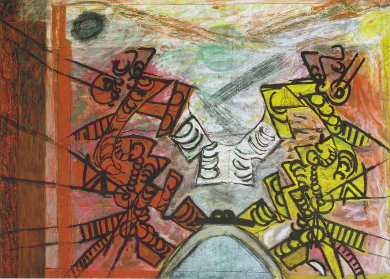
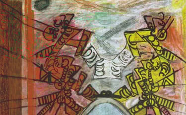
One of the first major works to emerge from Wilde’s austere studio at Sherborne House was The Marriage of Heaven and Hell (1971-72). It is a large and commanding work executed in gouache and pastel on paper. John Berger wrote in his 1955 review of Wilde: ‘[O]ne thinks that he paints the gates … on the very perimeter of the Conscious, beyond which is all the raw material which, when it is brought inside, is fashioned into our ideas of heaven and hell.’[29] Within this painting can indeed be discerned the gates of consciousness and Wilde’s genius. The glowing, scumbled colours recall the luminosity of late Turner paintings and the surface delicacy of a late Degas pastel. The line work has the commanding presence and authority of Japanese brushwork. These are all combined with raw determination and urgency, held in balance by a remarkable intelligence at work. Writing in The Times about the late works of Wilde, John Russell Taylor said: ‘[T]hought-form paintings, so dire in undisciplined hands, take off in his high tensile strength, and whether he is depicting Spacemen, evoking Pompeii or simply letting the lines wander with controlled freedom across a blue ground, as in the beautiful pastel Drawing of 1975, there is no doubting the power and independence of his vision or the casual skill with which he puts it on paper.’[30]
It is fascinating to look at the origin of some of Wilde’s apparently esoteric symbols. He returned endlessly to previous themes, creatively juxtaposing new and old imagery. The iconography of The Marriage of Heaven and Hell is particularly intriguing. My first clue to this dates back to the mid-1960s when Wilde had been commissioned by Bennett to do paintings for covers of his books. Energies, a drawing created for Bennett’s book[31] of the same name, is charged with a yellow Kundalini-like force surging through black-skinned perimeters while vermillion ribs ladder zebra-like down the torso. These symbols of human physicality and potential reappear in The Marriage of Heaven and Hell as mediator, Archangel, linking the perpetual opposites of good and evil. The ribbed forms represent change, transformation and spiritual development – all qualities that epitomize Bennett’s fusion of spiritual and philosophical ideas.
The repetition of precariously stacked circles in The Marriage of Heaven and Hell also suggests recurrence and balance. An endearing precursor to these stacked circles is found in a Zen-like ink and red crayon study of the same period (1973). It is a beautiful and delicate study of peas in pods, almost oriental in appearance. Although Wilde rarely worked directly from life, the inspiration must have been irresistible. His studio was only a few minutes walk away from a huge, walled garden at Sherborne House where vegetables and fruit were grown by and for Bennett’s students. On the reverse side of this drawing is a gridded preliminary drawing for Abstract (1973, gouache and pastel) whose cascading shapes are immediately identified in the new light of the recto drawing. Bennett so appreciated the swirling whirlpool of pictorial possibilities and meanings within Abstract that he asked Gerald to create another version to advertise Making a New World, a public talk he was giving in London that year, and which is also the title of one of Bennett’s books.
Samurai (1973), a limited edition silkscreen Wilde created at Sherborne with artist Roy Marsden, also calls upon some of the iconography within The Marriage of Heaven and Hell. Giving Samurai its title, Wilde eliminated any doubt as to the subject matter. This is the essentialized and poised form of a warrior about to strike. Forceful and angular, Samurai holds his isolated stance on a bloody battleground, asserting his affinity with hell itself. The blood-red colour field is balanced on the right by the smallest complementary touches of textured viridian outlined in deep yellow; ornaments, perhaps, upon the Samurai’s armour. The white outline of the principal pinky-mauve calligraphic body is stark. It is a bold and startling image.
As with Wilde’s easy affinity with the medium of textiles early in his career, his versatility is apparent in the success of his set design for an open-air production of Ibsen’s Peer Gynt at Sherborne in 1973.[32] The performance unfolded beneath a magnificent, towering larch tree perhaps as old as the stately home itself, with Wilde’s large painting The Troll Scene (1973) used as a backdrop. Painted in acrylic on canvas, it is now part of the Arts Council’s permanent collection. The surface is painterly with large and vividly coloured ovoid forms integrated by rhythmic and meandering, interpenetrating white lines. Pure colour shapes roll into an infinite depth only to be brought forward by white lines that create a magically woven maze. Patrick Heron commented that Wilde used colour as a composer uses counterpoint[33], and it is certainly true of this painting. It is like an entire musical composition captured instantaneously; the orchestral complexity and range upheld by colourful closely modulated colour forms and supporting linear stanzas.
Like Picasso and many modern artists, Wilde worked in series over long periods of time and revisited earlier themes. He made many interesting smaller variations on the large painting for Peer Gynt in different media. The reduction in scale is compensated for by their rich luminosity of surface and extraordinary delicacy. A symphony of movement occurs within the vast space he created in Pompeii (undated) with mesmerizing spiralling lines. Troll Scene (1975), a small work in oil pastel, has the same dynamic monumentality with great vitality and clarity of colour and movement. On the far right side a coffin-like metronome shape stands sentry, as if Wilde had shifted one of his previous painting’s almost horizontal bands to a vertical position, but the ill-omened shape had appeared in earlier works made during and after the war. In other versions this form casts an eerie negative shadow across the entire foreground, banding and graduating the depth like a landscape, but in this one painting the shadow mysteriously casts golden light. The shape is reminiscent of de Chirico or Magritte’s surrealist work, enigmatic and classical, but not overly referential. In another variation, Pompeii Drawing, Wilde allows an ephemeral and delicate cool pale blue ground to recede into hot cadmium yellows and oranges to produce a sense of intensely blinding light. Held within a claustrophobic room space with two door shapes either side is a swirling compression of forms, playful yet ominous, a Rorschach-like abstraction. There is also a small pastel version, Pompeii II (1975), in which Wilde brings the swirling symphonic movement into a moon-lit reverie of colour harmonies.
Wilde simplified these rhythms to great effect in a large work, Intelligence Now (1975, oil on canvas), by limiting his palette to a rich, deep red against a mauve ground. This was chosen for a book cover[34] (1975) of the same name and printed in complementary colours of yellow against mauve. The wave-like linear form and colours in both artworks create pure optical space and dynamic movement.
His work changed dramatically as he returned to figuration with new confidence in 1975. Colour, always hedonistically rich, became even more accentuated. Gradations disappear, purples rear against blues, reds against cadmium yellows. It was as if he had devised a new language of consonants, eliminating the earthy subtlety of vowels. In the Clown series (1975, pastel and gouache), Wilde pays homage to Miro and Klee with amorphic and quirky figuration. The horizon is the colours’ edge, with planes of velvety pastel receding behind the tragic and wretched clown, whose angst, in his confrontation with the bright light of the moon, is almost palpable. Clown is born of undulating forms of pure colour; the head and hands are almost an afterthought, yet the image evokes raw emotion as the figure rears back in horror. Could it be that Wilde has created a contemporary visual counterpart to those of colour theorists such as Goethe and Klee? Taken colour into a modern quasi-religious experience? Like the black-faced Christ of early Russian icons, one does not think 'Messiah’, one viscerally responds to Clown, and feels its despair.
The Spaceman series, also begun in 1975, evolved slowly and includes some of his finest drawings and colour work. A double-sided artwork, Spaceman, waves octopus-like tendrils that gesture within a brilliant formal composition. The drawings combine expressionistic draughtsmanship with authoritative compositions and command of space. One can journey deep into space, following the pulsating calligraphic lines into infinity. There are two pastel versions, which show Wilde’s mind at work as he experiments with rich electric colour. A 1975 gouache and pastel version evokes theatrical drama with a menacing quality similar to the stage sets of early German Expressionist films. Space stretches as two sides of a hellish, red-walled room loom up, filled with snaking black lines whose paths are familiar from previous series. A whirlwind of swirling red lines hits against a deep yellow ziggurat-like Spaceman whose form has become dense and oozes a bloody foetal shape. This Spaceman takes on an alien maternal aura within the malevolent atmosphere, and a curious horizontal black line near the top, which weaves through the forms, seems to prevent all escape. It sends one’s eyes back to the surface only to begin on another uncomfortable journey again. Oppressive red parallel lines on the left funnel the steadfast march of red and black semi-circles back into the room. Circular lines and forms are chopped, stretched and stacked, manipulated like clay.
Ideas, like colour, dart and resurface in a continual exploration of possibilities. Phantasmagoria (1978, gouache and pastel) marries themes from the Pompeii series with movement and colour similar to those found in the Spaceman drawings. A richly-worked shadow of violet-blue lurks in the pinkish-salmon space. Wilde’s familiar lyrical line work now becomes a spider-like force as it races, twisting and turning across the surface, changing colours as the lines move towards us. The far left periphery is haunted by the reappearance of his iconic coffin form, empty and ready to consume the hurtling, richly textured linear forms, or does it wait for us? Phantasmagoria has a totally enveloping atmosphere inhabited by otherworldly energies choreographed by Wilde, the existential magician.
Wilde’s figurative artwork of this period paradoxically contains some of the best abstract colour field work done in Britain. During this time the American artist Phillip Guston had also returned to highly personal yet idiosyncratic figuration. Both artists’ work benefitted from their virtuoso understanding of the plasticity of paint gained through decades of working with abstraction. Guston used a technique of working wet oil paints directly on the canvas, whereas Wilde was able to achieve the same optical integration of surface with the dry medium of pastel. The two artists’ late work also share existential angst and an appreciation of the mundane, each leavened by notes of pure wit.
In Bin Ends (1981), a painting for the cover of a poetry book of the same name by Victoria Rothschild,[35] Wilde took a simple line drawing of rubbish bins into expressionistic bleakness and pathos. Many other figurative line drawings appeared over the years, such as for Les Fleurs du Mal (1939), Clown (1975), Snowman (1977) and Rope Dancer (1978). They are enigmatic anagrams of a complex humanistic vision, seasoned with the humour necessary for survival. Herbert Read wrote of the peculiarly English phenomena of artistic nonconformists, both self-imposed and publicly imposed: ‘[W]hat is gained from seclusion, from intensive contemplation, and from obstinate independence is, objectively, an intensity of vision and, subjectively, a visionary intensity.’[36]
In the summer of 1977, the Arts Council chose Wilde for a prestigious one-person show at the Serpentine Gallery. It should have provided a brilliant re-launching and reassessment of his career, but as so often happens with good intentions, the show was not a retrospective, nor did it represent his work well. Through inadequate research or poor judgement, only one piece of his late work was included, giving the show a nostalgic and heavy atmosphere. To add further insult, Tim Hilton wrote in the catalogue for the show: ‘Since that date [1954] he has painted only sporadically.’[37] This was a statement that could not have been further from the truth.
To question why an artist of Wilde’s stature is still so little known leads one to face the power of the financial interests behind the commercial art market, of dealers and collectors who are instrumental in promoting or neglecting an artist, which can have a devastating effect on any artist’s confidence. The media adores artists with extroverted, outrageous personalities, and the reality was that Wilde was a solitary and highly sensitive man, plagued by depression from his war experiences and from the lack of acceptance of his artwork despite the respect of a few good people. He took risks with the result that his artwork was never mainstream and often difficult to market. The 1940s and 1950s were a particularly difficult period for many British abstract artists. Patrick Heron attempted to redress the perceived balance of art history to show that during that period, the work of British Abstract Expressionist artists actually pre-dated their American counterparts. The Americans were more successful because they had the benefit of an enthusiastic art market and more financial assistance in a more quickly recovering post-war economy. Tate Britain’s website biography of Wilde now begins with the words: ‘Gerald Wilde. Painter of abstract expressionist compositions.’[38]
Consistent throughout Wilde’s career was his highly original use of colour and his sophisticated, contemporary draughtsmanship. Within each artwork, whether a drawing, print or painting, was profound integrity and vision. His talent was exceptional and his life was hard-won. In 1979, the October Gallery befriended Wilde and provided the emotional and professional support that he so desperately needed, and they have continued to exhibit and represent his work with enthusiasm. Today the Tate owns three major works by Wilde: Fata Morgana (1949), Red Composition (1952), and The Marriage of Heaven and Hell (1971-72). In 1980, The Arts Council included Wilde in their exhibition British Art 1940-1980 at the Hayward Gallery. In 1987, the year after he died, he was included in an important survey exhibition at the Barbican Art Gallery aptly titled A Paradise Lost: The Neo-Romantic Imagination in Britain 1935-55, and his work was shown again, in 2002, at the Barbican in the exhibition Transition. One can only hope that Wilde will soon receive the public recognition that his work so clearly merits in a truly retrospective exhibition at a national British art institution. The art critic William Feaver gave a fitting testament to the importance of Wilde’s work in 1981: ‘It is perhaps with the likes of Gerald Wilde, long disregarded but nonetheless still active, that the continuity and vitality of current art is best identified. There are others like him in the sense that they work without promotional gambits or career prospects in mind. Wilde ... represents the surviving and essential instincts for art as moral expression rather than mere sensual display. If a single theme or maxim can be proposed as a verdict on the current scene, it surely must be to the effect that innovation of a lasting sort is unusual and likely to be ignored. Conditions rarely permit it to surface in London’s commercial galleries – at any rate, not until the artist concerned is well and truly dead.’[39]
FOOTNOTES
[1] Arts Review, Guardian, 28 January 1980.
[2] British Council Visual Arts: http://visualarts.britishcouncil.org/collection/artists/gerald-wilde-1905
[3] Joyce Cary, ‘Gerald Wilde’, Nimbus, Volume 3, No. 2, 1955.
[4] British Council Visual Arts: http://visualarts.britishcouncil.org/collection/artists/gerald-wilde-1905
[5] David Sylvester, 6 November 1960, The Observer.
[6] Adrian Clark, Review of ‘Exhibitions of Neglected British Century Painters: Prunella Clough and Gerald Wilde’, March Fine Art Fair, Olympia and Millinery Works Gallery, 2004: http://www.britishandirishart.co.uk/exhibitions-of-neglected-british-century-painters-prunella-clough-and-gerald-wilde-2/
[7] Personal letter, December 1981.
[8] http://www.millineryworks.co.uk/pages/argal_Wilde1.htm
[9] http://www.wallpaper.com/fashion/ascher-reissues-artist-designed-scarves
[10] Zika and Lida Ascher produced artist-designed dress fabrics and scarves, and were the first to commission an abstract expressionist fabric from Gerald Wilde in 1947. One was a screen-printed silk twill crepe, printed by John Heathcoat & Co. with an abstract design in jewel-like colours of magenta, mauve, cerise, tangerine, orange, yellow, lemon, aquamarine, mid-blue, all outlined in black, 80 cm sq. and another worn by Princess Margaret was described by Woman magazine as being ‘lovely … yellow and grey pure silk’. An image of this scarf can be seen at: http://www.meg-andrews.com/item-details/Ascher-Scarf-Gerald-Wilde/6589A photo of Wilde’s scarf as well as one of the Queen wearing one of his designs can be seen at the following two sites: http://historicallymodernquilts.blogspot.co.uk/2014/09/modern-print-monday-lida-and-zika-ascher.htmlhttp://historicallymodernquilts.blogspot.co.uk/2014/08/principles-of-modernism-line-for-lines.html
[11] http://fashion.telegraph.co.uk/news-features/TMG8137062/Ascher-London-is-relaunched.html
[12] John Berger, The New Statesman and Nation, 24 September 1955.
[13] David Sylvester, 29 September 1955 issue of The Listener.
[14] John Russell Taylor, review of Gerald Wilde’s 1981 exhibition at the October Gallery.
[15] British Council Visual Arts: http://visualarts.britishcouncil.org/collection/artists/gerald-wilde-1905
[16] David Sylvester quote: https://richardawarren.wordpress.com/2012/12/18/the-mad-artist-gerald-wilde/
[17] Ibid.
[19] https://richardawarren.wordpress.com/2012/12/18/the-mad-artist-gerald-wilde/
[20] David Sylvester, The Observer, 6 November 1960.
[21] John Berger, The New Statesman and Nation, 24 September 1955.
[22] David Sylvester, The Times, 15 September 1955.
[23] John McEwen, The Spectator, 25 February 1981.
[24] John Graham, Systems and Dialectics of Art, John Hopkins Press, Baltimore, 1971, p. 95.
[25] J.G. Bennett, Transformation of Man, Coombe Springs Press, 1973.
[26] Review, BBC 2, June 1972, Alan Yentob, director.
[27] Personal letter, December 1981.
[28] J.G Bennett, Gurdjieff Today, Coombe Springs Press, 1974, p. 31.
[29] John Berger, The New Statesman and Nation, 24 September 1955.
[30] John Russell Taylor, The Times, 17 February 1981.
[31] J.G. Bennett, Energies: Material, Cosmic, Vital, Coombe Springs Press, 1964.
[32] Director, Michael Frederick, 1973.
[33] Personal letter, February 1982.
[34] A.G.E. Blake, Intelligence Now, Coombe Springs Press, 1975.
[35] Victoria Rothschild, 'Bin Ends', Editions Poetry, London, 1980.
[36] Herbert Read, Contemporary British Art, Penguin, 1964.
[37] Tim Hilton, Gerald Wilde, Serpentine Gallery catalogue, Arts Council, 1977.
[38] Tate London website: http://www.tate.org.uk/art/artists/gerald-wilde-2145
[39] William Feaver, Art News, New York, May 1981.
The Existential Magician:
The Life and Work of Gerald Wilde
Dr. Victoria King
A more extensive illustrated version of this essay can be seen at: https://geraldwilde.blogspot.com/2023/08/gerald-wilde-british-artist-1905-1986.html
© Dr. Victoria King
vkblackstone@gmail.com
The Marriage of Heaven and Hell, Gerald Wilde, pastel and gouache on paper, 153 x 212 cm, collection of Tate Gallery, London.